Monday, July 4, 2011

Album Covers


In addition to my older post, my collage music posters, I made them in to album covers and added an additional band, City & Colour. All of these are hand made and then scanned in to the computer.


Saturday, July 2, 2011

My Second Stop-Motion Animation


My DVD cover (spread out) for the 'For Her' animation


This is the second stop-motion animation that I made called For Her. The style of this animation is similar to my first one (scroll down to have a look). These are all paper cut outs. The song on this animation was created and performed by my boyfriend, Sho Murakoshi. The animation is based on a poem that I wrote. (I'm sorry for the soft music, it is better to listen to it with earphones)
Please read the poem before you watch the animation, thank you! =o) (hope you guys like it, enjoy!) :


I remember when I was a child

How you used to wake me up with a smile

You took care of me with so much love

Even if we didn’t come from the same home

You treated me like one of your own

A vivid memory of mine that I will never forget

Even at times when I was such a pest

You treated me like one of your best

Then the time came when something was wrong

I promised myself that I was going to be strong

The night you were stuck in a room surrounded with four white walls

And men with white coats checking on every call

Then I had to leave you for a while

And you said “goodnight, see you tomorrow” but with a weak smile

….

I never did see you again

God had other plans for you, my beloved friend

It is hard for me to believe that you are forever gone

Even after 4 years long

But you are in a better place now, they would say

Though til today,

the memory I have of you and the never ending love that I feel will forever and always stay.


Poster


Poster for my Graphics 4 class when I was in University. Went to the venue to check the place out. I did the poster out of a photograph I took and a picture of a gramophone. Jalapeno Sound System is an electronic funky band, that was what the project was based on, I listened to their music to suit the style of the poster.


Posters- Iconic Musicians

Two collage posters that I did to pay a little tribute to two very iconic musicians in the music world, Jimi Hendrix & Bob Marley.


My Animal Cruelty Posters


How would you feel if it were the other way around??


My T-shirt Designs

These are my t-shirt designs. In my older posts, you'll notice two posters and album covers for the band Lady of the Sunshine and Angus & Julia Stone for their songs called The Wolf and The Crow. I took the wolf and the crow drawing that I did and switched it up to make them in to my t-shirt designs. Both designs can be made for males or females. Let me know if any of you out there would like one for yourself, the are for sale =o).


Project- Soul Magazine

The brief of this project was to make a cover page, an index page and a two spread page article for "Soul Magazine". It was a music "magazine" and we each had to choose a genre or genres (if we wished) and a style for our magazine. My music genres was acoustic folk and indie, I wanted the style of my magazine to be illustrative with colors that match the genres of the music. On the cover is none other than the musician, Devendra Banhart (if you haven't heard of him, you must check him out) and on my two page spread I decided to have the article based on a band called the Bowerbirds (in relation to my drawing of them, scroll down to see). Other than that, I had to create my very own "Soul" logo. My magazine was based on acoustic folk and indie bands, therefore, my Soul logo was a guitar and it had a woody field to it to go along with the genres as well as the type I chose for it. I chose the simple typography for the rest of the magazine because the illustration and colors were already so brought out that I didn't want the type to be a distraction.


The Cover of the Magazine


The Index Page


The Two Page Spread


My First Stop-Motion Animation


This is a stop-motion animation that I did. It's based on inner emotions and how something tragic can trigger them. With the "perfect family portrait' in the beginning it shows how everything looks normal and great but behind the picture it has a different story to it and how everyone has their own inner emotions on how to deal with things. Emotions like these are hard to see and as humans we're all very good at keeping it in. I made these out of paper cutouts and took it shot by shot. It took quite a while to finish it and I edited it on the computer. The song is by an amazing musician called Jose Gonzalez and it's called "How Low'. Hope you guys like it. Enjoy!

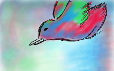
Rainbow Bird -from the Ipad

My former flatmate had a drawing/painting app on his Ipad and I decided to try it out and made a rough sketch of this. If I had an Ipad, this app would definitely be the first thing I would get, the app response well on the Ipad and it's fun when you're bored or on a long journey to somewhere. Now..if only i remembered what it was called....

A Collage Experiment


Posters I made as an experiment, instead of creating it from photoshop, I decided to make it from scratch and do a collage with some spray paint and cutouts. I love making things by hand. The first band is an electronic group and the second is a metal core band.

Friday, July 1, 2011

Fazer Logos - Graphics 4 project


A project I did when I was in university for my Graphics IV class. I had to create two logos for two different music genres using the same company name.

Legend

Jimi Hendrix - calling him an amazing musician is an understatement. His creativity and the power he had with his guitar, it's just....speechless

the band Bowerbirds


A picture from a magazine that I saw and decided to draw with a few touches of washed out colors.