Monday, June 28, 2010
Wednesday, June 16, 2010
Stop-motion Animation
Haiku
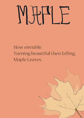
Haiku is a form of Japanese poetry. This is a project for one my classes and it was based on the art of Haiku poetry. It is a series of four Haiku poems that you've picked from the internet, books, etc. In this project we had to mix type with image and the brief was to create your own type for the poems title, mixing east meets west because it was in english we had to make the type had an eastern influence to it to keep its originality. I drew out the type from A-Z and scanned it in to the computer.
The illustrations were drawn by me.
No Signal
This poster is for a short film, a student project, called No Signal done by students in the Media Production department in my university. Written & Directed by Sho Murakoshi, D.O.P: Daniel Martin and Producer: Timothy Lems. It's a great short film!
I helped out on the film set as a runner (my good friend Mona and I had to run around and get everything they needed) and I helped to take some behind the scenes pictures too.
I decided to try and make a poster for the short film, for my own use with the director's permission =oD.
Beautiful
Friday, May 14, 2010
a fish eye world
I got a fish eye film camera for my birthday this year and I absolutely love it. I carry it with me where ever I go, because it is a film camera I always get excited to see how the end results look like. Well...sometimes it's pretty shit haha but sometimes you get images that you thought went horribly wrong but it turns out to be pretty cool, it's a nice little surprise =o).
The man who got me the amazing fish eye film camera for my birthday =o).
Diptychs!
Thursday, May 13, 2010
paintings with a twist
These are a series of paintings that I made. I did the paintings, took a picture of it and tweaked it on photoshop. I couldn't scan it in as it was quite big. It is basically based on emotions. A teary eye could be for sadness or for happiness, an open mouth could be for a scream or a terrifying laughter and a hand could be for anger or..well, a punching usually just means anger but depends on how you wanna look at it =o).
METRO (group project)
This was for an Advertising class that I had. It was a group project and each group had a different brief. The brief was taken out of D&AD (Design & Art Direction, a British educational charity which exists to promote excellence in design and advertising) and it was used in our class. Our group (Andrea, Keomarney, Me, Mo & Nour) got the brief for a free London newspaper company called the Metro. The brief was for us to create a poster that would show what the Metro was about. The slogan we came up with was "This is Me, This is Metro". Basically, Metro's brief wanted us to let people know that the Metro isn't just a newspaper but a personality or identity and it aims towards young urbanites from age 18-40. Taking the 'personality/identity' part in consideration we took a few pictures of young urbanites in different outfits and the reason why the head is cut off is because we want someone on the streets to walk by the poster and go "hey, that could me be". For Metro, it isn't just about being a newspaper.
Here's one of the posters that we made:
in the love of music
A self project that I had set for myself. A series of posters for different bands and a design of their CD, the album cover art which I did as well, looks like the poster but just in an album cover format so I didn't post it on here.
I'm planning to make the art for the poster in to a T-shirt design, it will be posted here once I make it! =o)
An old school mate from high school is in this band, Halfway Kings. She is an amazing singer and they are a very talented band that makes chilled music. I decided to make a poster and a CD design for them. Here's a link to their blog, check their music out: http://halfwaykings.blogspot.com/. You'll see my poster design on their blog too, I was happy to hear that they liked it. Though, the design on their blog has a different colored background it's in purple but in order for this series to go together I made it gray for myself.
As you can tell, I love this band! haha. In some ways their music inspires me in my creativity, listening to their song 'Black Crow' made me produce this art work. Their music helps me out through a tough day sometimes. I saw them live in London and I have to say, it was one of the best gigs I have ever been too..so far ;o). Check them out if you can! (http://www.youtube.com/watch?v=5FlJYPBTyqU)
whaa...?
typography!
A project for my typography class. The brief was to choose a few bands that you like and to make an album cover art using only two certain kinds of type (Univers or Perpetua). The album cover art must consist of the artist/band name, the name of their album and a verse from one of their songs. The first album is a musician called Zee Avi and the second is a band called Angus & Julia Stone.
pictures tell silent stories
Rain drops and street lights do wonders for a picture.
Swings are awesome.
Took pictures for an event at QEII (a restaurant & bar in Penang check 'em out [http://www.facebook.com/pages/Penang-Malaysia/QEII-The-360-Waterfront-Venue/11413864398?ref=ts] they've got great food and it's a great place to party too). There were some Malaysian rock bands performing at this event. The screaming man in the picture is a singer from the band, Love Me Butch.
A day at Waterloo.
It was freezing on the day I took this picture. It was possibly in the month of January or February..ahh...London. Despite the cold weather, I took a lot of pictures and it was a beautiful sunny-snowy day!
Subscribe to:
Posts (Atom)